

Colours
Colour Rationale
In selecting the colour palette for our application, we meticulously considered not only aesthetic appeal but also the psychological and physiological effects of colour on users.
Our primary colour, “Light green” (#9DB580), was chosen for its calming and soothing properties. Green, often associated with nature and growth, resonates with users on a subconscious level, fostering feelings of tranquility and balance. This aligns perfectly with our application's theme, where users seek solace and support in their journey. Additionally, light green is scientifically recognized as a neutral colour for the human eye, reducing visual strain and ensuring a comfortable viewing experience for our users.
Light green
#9DB580
Complementing our main colour, we integrated “Light gray” (#D9D9D9) and “Background gray” (#F3F3F3) to provide contrast and balance to the overall design. These subtle hues create a harmonious backdrop, allowing the vibrant elements of the interface to stand out without overwhelming the user.
Light gray
#D9D9D9
Background gray
#F3F3F3
Meanwhile, the inclusion of “Normal green” (#627952), “Dark green” (#465939), “Black green” (#3F4636), “Brown” (#705F44), and “Black” (#000000) adds depth and richness to our palette. By incorporating these green and earthy tones, we aim to evoke a sense of grounding and reassurance, reinforcing our commitment to supporting users through their journey with our application.
Normal green
#627952
Dark green
#465939
Black green
#3F4636
Brown
#705F44
Black
#000000
Furthermore, the choice of “Primary white” (#FFFFFF) and “Light beige” (#EEE1CC) serves to enhance readability and contrast, ensuring that essential information is easily accessible and legible. White represents purity and simplicity, while the beige adds a nice touch of warmth and softness to the overall aesthetic.
Primary white
#FFFFFF
Light beige
#EEE1CC
Together, our colour palette is thoughtfully crafted to not only visually appeal to users, but also to promote feelings of calmness, stability, and trust. We believe these colours create a welcoming environment, inviting users to engage with our application comfortably and confidently.
Contrast Checker Results
(on our main combinations)
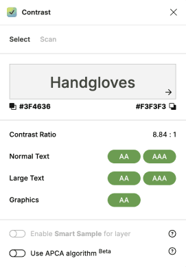
"Black green" against "Background gray" :
This combination meets accessibility guidelines.
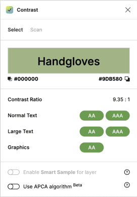
"Black" against "Light green" :
This combination meets accessibility guidelines.
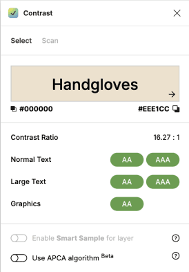
"Black" against "Light beige" :
This combination meets accessibility guidelines.
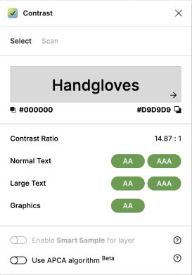
"Black" against "Light gray" :
This combination meets accessibility guidelines.
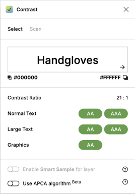
"Black" against "Primary white" :
This combination meets accessibility guidelines.
Button variations and states (examples)


Text on solid colour backgrounds (examples)


